Widget list
This section describes the available widgets and their options. The following examples show the designer version of the widget as well as an example of what the end user sees.
Widget icons
When a widget is added to the designer, it's associated icon can be seen in the top right corner of the widget area (not shown here). This makes it easier to see which kinds of widgets have been added to the page since OpenQuestion uses different interfaces for survey development and end user data acquisition.
text_box
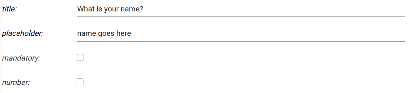
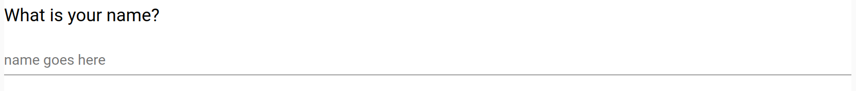
The text_box is used for short text or number responses. It can be configured with the following options:
-
title. The label displayed on this widget. For example, "What is your name?"
-
placeholder. Text that prompts the user. For example, "Type your name here"
-
mandatory flag. If checked, this field must be filled out by the user before the survey can be submitted
-
number. If checked, this field will be restricted to a number
Designer
Survey
text_area
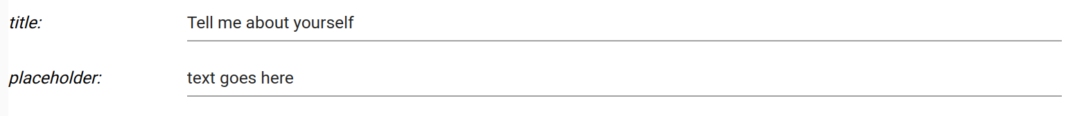
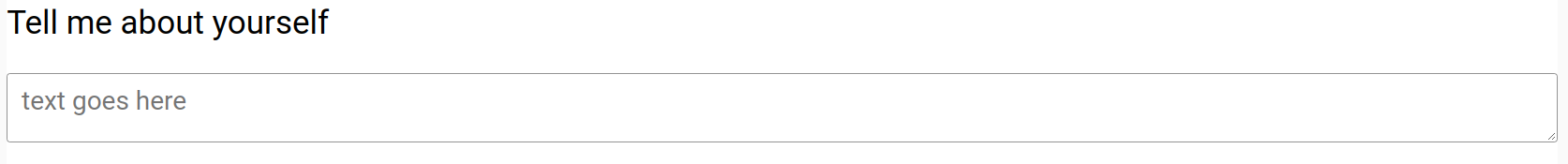
The text_area widget is used for long, possibly multi-line text responses. It can be configured with the following options:
-
title. The label displayed on this widget. For example, "Tell me about yourself"
-
placeholder. Text that prompts the user. For example, "text goes here"
-
mandatory flag. If checked, this field must be filled out by the user before the survey can be submitted
Designer
Survey
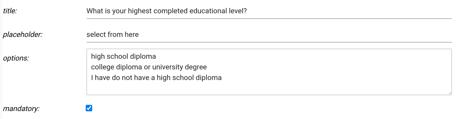
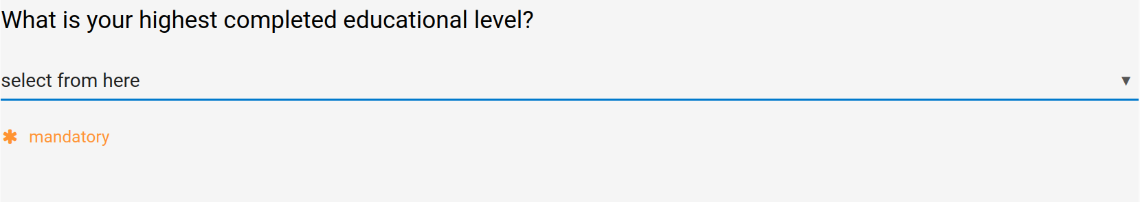
drop_down
The drop_down widget is used for selecting from a set of categories. It can be configured with the following options:
-
title. The label displayed on this widget. For example, "What is your highest completed educational level?"
-
placeholder. Text that prompts the user. For example, "select from here"
-
options. Newline separated list of options to be displayed in the drop down
-
mandatory flag. If checked, this field must be filled out by the user before the survey can be submitted
Designer
Survey
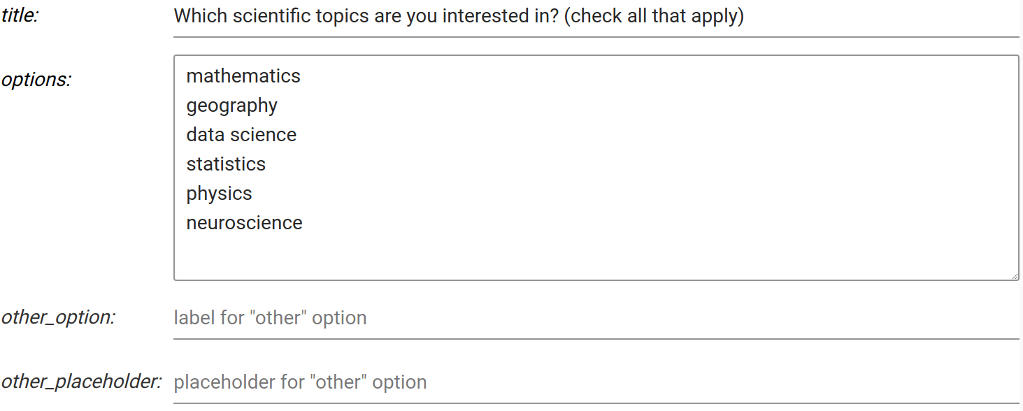
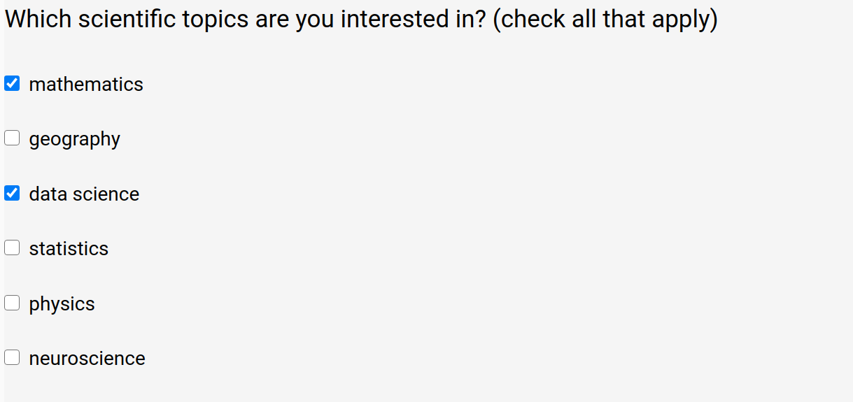
check_box
The check_box component is used for selecting from a set of options where more than one option can be selected at the same time. It can be configured with the following options:
-
title. The label displayed on this widget. For example, "Which scientific topics are you interested in?"
-
options. Newline separated list of options
-
other_option. Label for an additional check box option. When checked, it will display a text box
-
other_placeholder. Text that prompts the user (associated with other_option). For example, "Please describe"
Designer
Survey
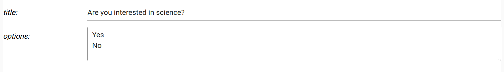
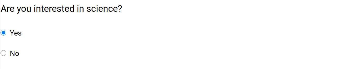
radio_button
The radio_button component is used for selecting from a set of options where only one option can be selected at a same time. It can be configured with the following options:
-
title. The label displayed on this widget. For example, "Are you interested in science?"
-
options. Newline separated list of options
Designer
Survey
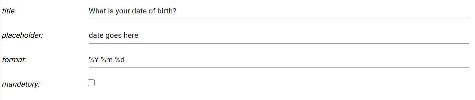
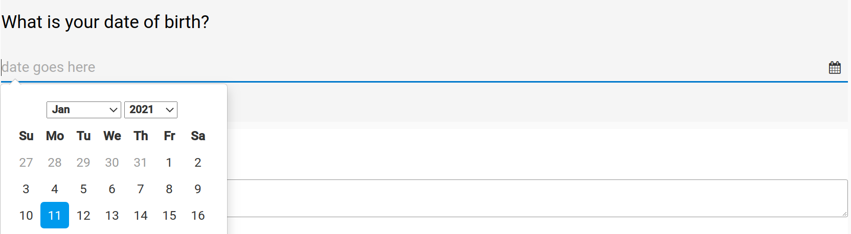
date
The date widget is used for selecting dates from a "date picker" interface. It can be configured with the following options:
-
title. The label displayed on this widget. For example, "What is your date of birth?"
-
placeholder. Text that prompts the user. For example, "date goes here?"
-
format. Date format string based on these directives. For example,
%Y-%m-%dyields2021-01-11in terms of the format. -
mandatory flag. If checked, this field must be filled out by the user before the survey can be submitted
Designer
Survey
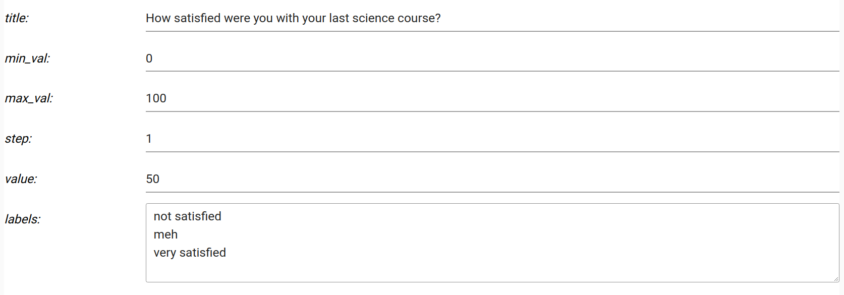
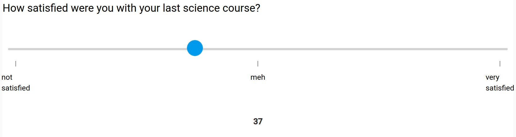
slider
The slider widget is used for choosing a quantitative value from a range. It can be configured with the following options:
-
title. The label displayed on this widget. For example, "How satisfied were you with your last science course?"
-
min_val. The minimum value shown on the slider
-
max_val. The maximum value shown on the slider
-
step. The number of discrete steps that the slider "thumb" can occupy between the min and max values (inclusive)
-
value. The initial value of the slider "thumb"
-
labels. Newline seperated text labels that will be evenly spread across the width of the slider widget
Designer
Survey
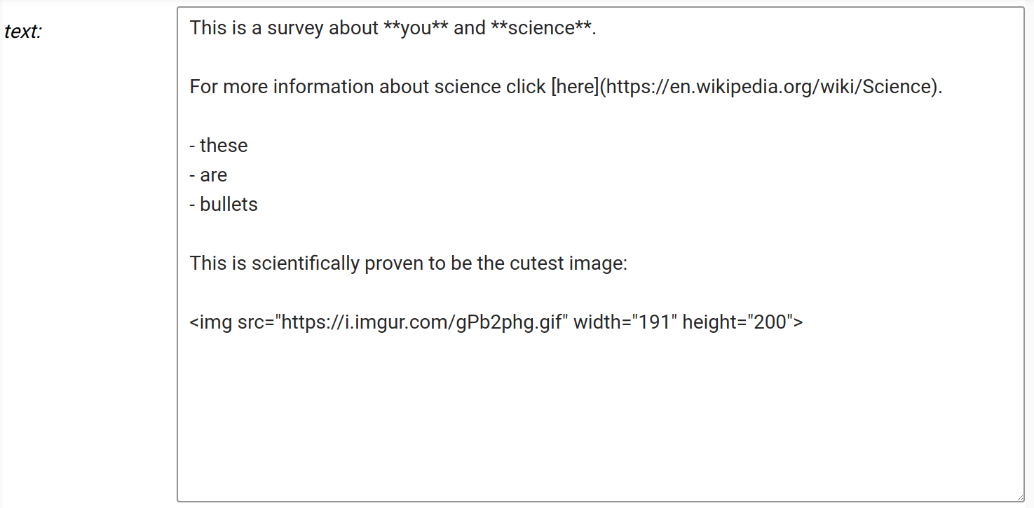
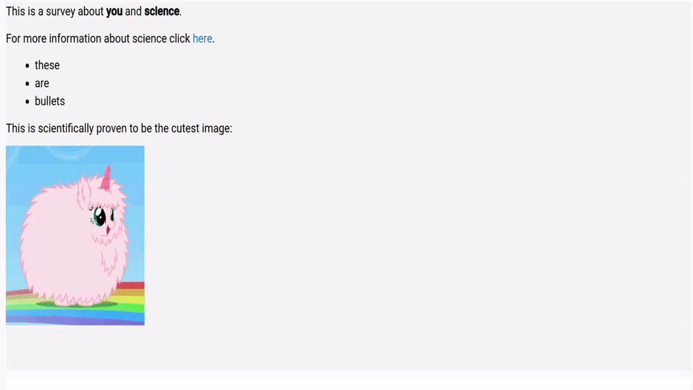
markdown
The markdown component is used for blocks of rich text, including links, images, gifs, bullet points, raw HTML, and more. It can be configured with the following option:
- text. The markdown text based on the mistune parser
Designer
Survey
section
The section widget is used to hold other widgets and give a visual separation of sets of widgets (within a single page). Sections have their own title which can be set in the "title" field which is the label (e.g., "Contact information"). Note that OpenQuestion does not yet support multi-page surveys.
Widget IDs
Each widget that is added to the page is also assigned an ID. This can be ignored as it is mainly used internally (although, IDs can disambiguate widgets that have been given the same title, especially in the branching interface).
Are widget settings represented as key/value pairs?
Yes! In fact, all survey settings are represented by an underlying and accessible JSON/Python dict where keys and values correspond exactly to what is shown in the designer